

Best Practices for Designing Responsive Websites
this post is for those programmers who are at the very beginning of their careers and are creating their first applications or websites. here's a bit of my experience that helped me a lot at the beginning. 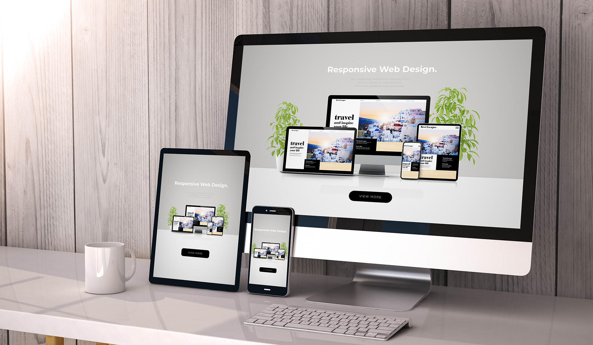 Below are some best practices for designing responsive websites: `Mobile-first approach`: Start by designing for the smallest screen size first and then gradually move towards larger screen sizes. This ensures that the website is optimized for smaller screens and loads faster. `Use a responsive framework`: Responsive frameworks like Bootstrap provide a grid system that helps in creating responsive layouts quickly. This also ensures that the website is compatible with different screen sizes. `Optimize images`: Large images can slow down the website's loading time, so it's important to optimize them for web use. You can use image compression tools like TinyPNG or JPEGmini to reduce the size of images without affecting their quality. `Use media queries`: Media queries allow you to apply different styles to different screen sizes. This helps in creating a consistent user experience across different devices. `Test on multiple devices`: It's important to test the website on different devices to ensure that it looks and functions correctly on all of them. You can use tools like BrowserStack or Device Mode in Google Chrome to test the website on different devices. `Keep it simple`: Avoid using too many complex design elements or animations that can slow down the website's loading time. Stick to simple and clean design principles that are easy to read and navigate on smaller screens. `Use scalable fonts`: Use fonts that are scalable and easy to read on smaller screens. Avoid using fonts that are too small or difficult to read on smaller screens. ## <br>Tools and Technologies used to Create Responsive Website There are several tools and technologies used to create responsive websites. Some of the most popular ones include: **HTML and CSS**: These are the basic building blocks of any website and are used to create the structure and style of the website. **CSS frameworks**: Frameworks like Bootstrap and Foundation provide pre-built CSS styles and components that make it easier to create responsive websites. **CSS preprocessors**: Preprocessors like Sass and Less allow developers to write CSS more efficiently by providing features like variables, nesting, and mixins. **JavaScript**: JavaScript can be used to add interactivity and dynamic behavior to a website. It is often used for things like responsive navigation menus and sliders. **Responsive design tools**: There are many tools available that help with responsive design, such as media query generators, viewport testing tools, and responsive design frameworks. **Content management systems (CMS)**: CMS platforms like WordPress, Drupal, and Joomla have built-in responsive design features and templates that can be used to create responsive websites. **Mobile app development platforms**: Platforms like React Native and Flutter allow developers to create mobile apps that are optimized for different devices and screen sizes. ## <br>Understanding Media Queries Media queries are a CSS technique used for styling web pages based on the device or screen size they are viewed on. With media queries, you can define different styles for different devices or screen sizes, such as desktops, laptops, tablets, and mobile devices. here's a practical example of how to apply the sizes ```css /* styles for mobile devices */ @media(min-width: 320px){ /* styles for screens larger than 320px */ } @media(min-width: 480px){ /* styles for screens larger than 480px */ } @media(min-width: 768px){ /* styles for screens larger than 768px */ } @media(min-width: 1024px){ /* styles for screens larger than 1024px */ } ``` Let us know in the comments how your experience with website development is going and what else you need to learn, so that we can help you. Thanks😉